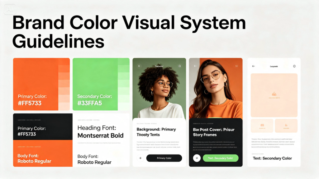

Most small businesses land on brand colors early — maybe from a logo, maybe just a palette that felt right at the time — but far fewer actually build those colors into a working visual system. The result is a feed where the colors technically match the logo, but the overall look still feels scattered and unplanned.
An AI image generator by Dreamina makes it possible to turn a simple color palette into a full, repeatable visual system without hiring a brand agency to map it all out. Dreamina’s advanced image generation capabilities mean a business can test how its colors actually behave across dozens of scenes before committing to a final visual direction.
Why having brand colors isn’t the same as having a system
A logo with two or three defined colors tells you what those colors are, but not how they should show up in a photo of a product, a background texture, or a lighting choice. A true visual system answers those questions in advance, so every new piece of content has a built-in color logic instead of being decided fresh each time.
Breaking a palette into functional roles
Rather than treating every brand color as equally weighted, it helps to assign each one a job:
- A primary color that shows up most often, usually in backgrounds
- A secondary color used for accents and smaller details
- A neutral, like cream or off-white, that gives everything room to breathe
Testing how colors behave under different lighting
The same teal that looks rich and moody under warm studio light can look flat or muddy under harsh daylight. Before locking in a system, it’s worth generating a few test scenes under different lighting conditions to see which version of the palette actually photographs the way the brand intends.
A second scene using the same color logic
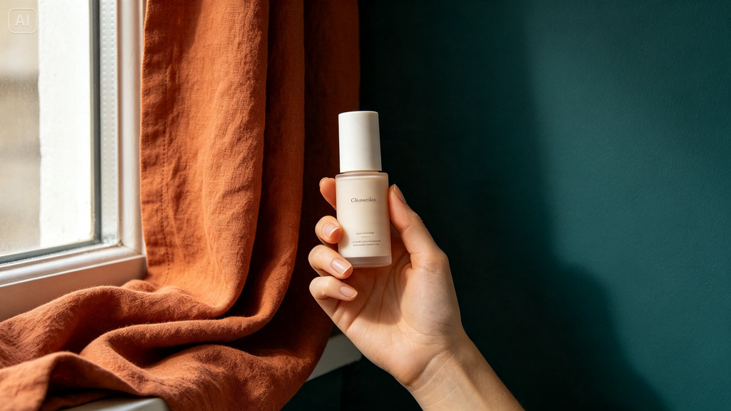
A visual system proves itself by working across completely different subjects while keeping the same color feel. Here’s a related prompt, using the same palette as the first but for an entirely different scene: a minimalist lifestyle scene of a hand holding a skincare product against a deep teal wall, warm terracotta accent fabric draped nearby, soft natural window light. Despite the different subject, the color and lighting language stays recognizably the same.
Deciding how much color per image is too much
A common mistake is trying to fit every brand color into every single image, which ends up looking busy rather than cohesive. A stronger approach leans on one dominant color per image, with the others appearing only as small accents — the full palette shows up across the grid as a whole, not crammed into each individual post.
Documenting the system so it’s easy to reuse
Once a color system is tested and working, it’s worth writing it down somewhere simple:
- Which color dominates which type of post
- Preferred lighting style for each color combination
- A short list of “avoid” combinations that didn’t test well
- Reference images to match tone against for future generations
Building the visual system with Dreamina
Step 1: Write a text prompt
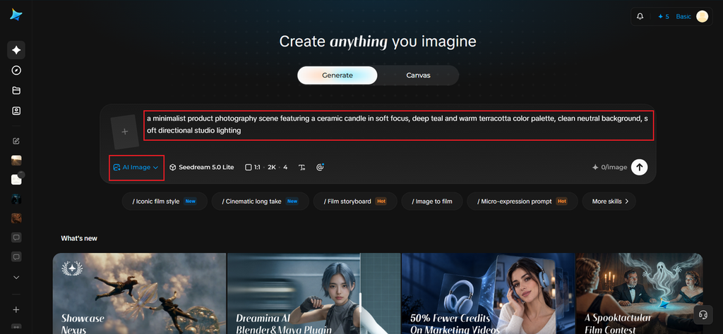
Open Dreamina and describe a scene using your brand’s exact color language, along with the lighting style you’re testing.
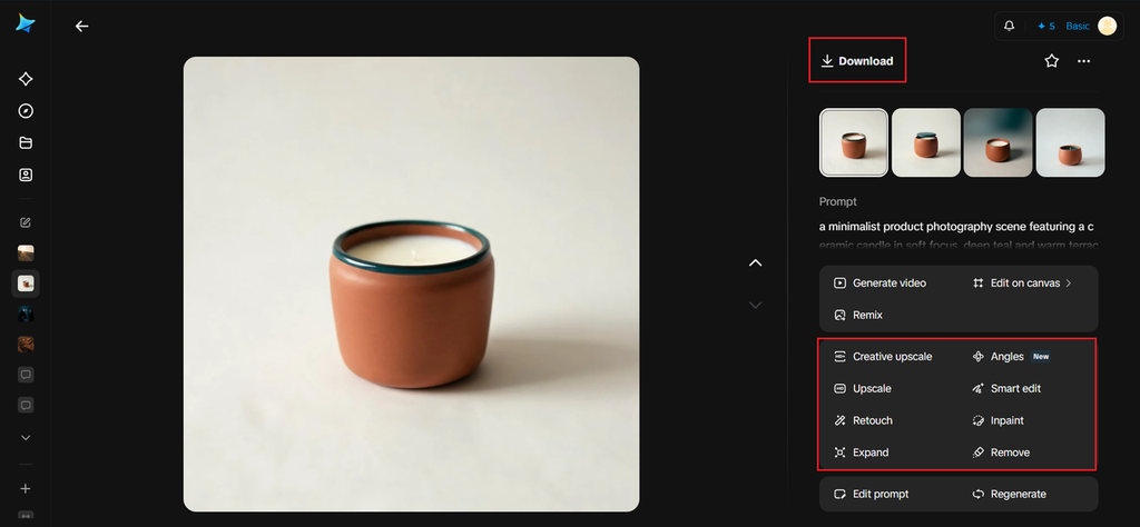
For the candle example, a prompt like: a minimalist product photography scene featuring a ceramic candle in soft focus, deep teal and warm terracotta color palette, clean neutral background, soft directional studio lighting
If you have brand guideline color swatches, upload them as a reference image so Dreamina can match the tones closely.
Step 2: Adjust parameters and generate
Choose Image 5.0 Pro by Seedream 5.0 Pro as your model for accurate, consistent color rendering across multiple generations. Select your aspect ratio based on the platform you’re testing for — square for feed posts, vertical for stories — and pick 1K for quick color tests or 2K once you’ve settled on a final direction. Tap Dreamina’s generate icon to produce the scene.
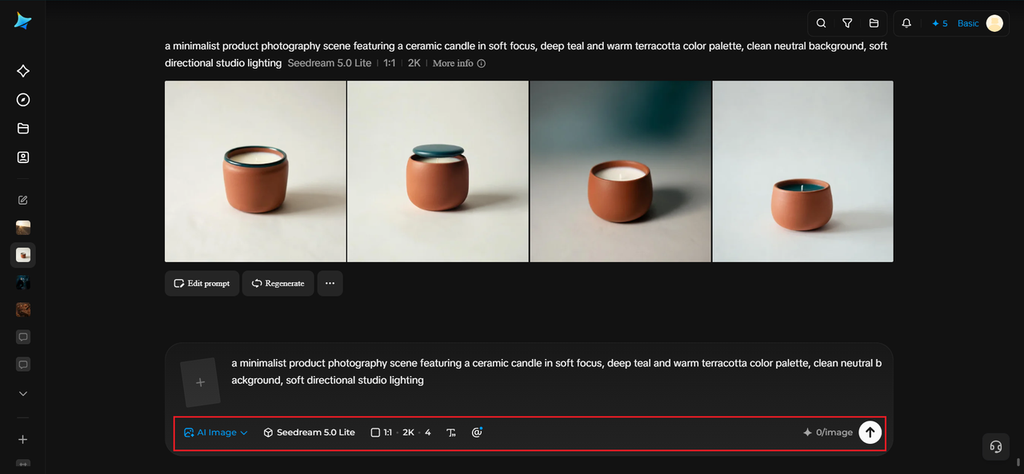
Step 3: Customize and download
Use Dreamina’s editing tools to fine-tune color accuracy — inpaint to adjust a specific area’s tone, expand the canvas if you need more background to test the palette against, remove any element that clashes, and retouch for overall balance. Once the colors feel right, click download and save it as a reference for your visual system.
Dreamina’s models and color consistency
Building a reliable color system depends on a model that renders tones consistently across many different generations, which is where Dreamina’s lineup makes a real difference. Seedream 5.0 Pro, the platform’s newest model, is particularly strong at holding true to specific color values across varied scenes and lighting conditions, making it the most dependable choice when color accuracy is the whole point of the exercise.
Nano Banana offers a softer, slightly more stylized color rendering that can work well for brands wanting a gentler, more pastel-leaning system. GPT Image 2 provides another option for comparing how the same palette renders under a different model’s interpretation, which can be useful when deciding exactly how saturated or muted the final system should feel.
Refreshing the system without breaking it
Brand palettes sometimes need a refresh after a year or two, but a full color overhaul risks confusing an audience that’s grown used to the existing look. A softer approach — shifting saturation or adding one new accent color while keeping the primary tone recognizable — updates the system without starting from zero.
Signs the color system needs attention
If engagement on visually inconsistent posts is noticeably lower than on posts that follow the system closely, that’s a practical, data-backed reason to tighten things up rather than treating color consistency as a purely aesthetic preference.
Conclusion
Brand colors only become a real asset once they’re built into a working system rather than just listed in a style guide. With a clear breakdown of color roles and Dreamina generating test scenes that prove out how those colors actually look in practice, a small business can move from “we have brand colors” to a feed that genuinely feels like one connected visual identity.